Digital Nourish
Brand Identity for a holistic health and wellness brand.
-
Digital Nourish is a health and wellness brand focused on helping adults break free from limiting habits through holistic practices. The identity was built around personal growth and the confidence individuals gain throughout their wellness journey.
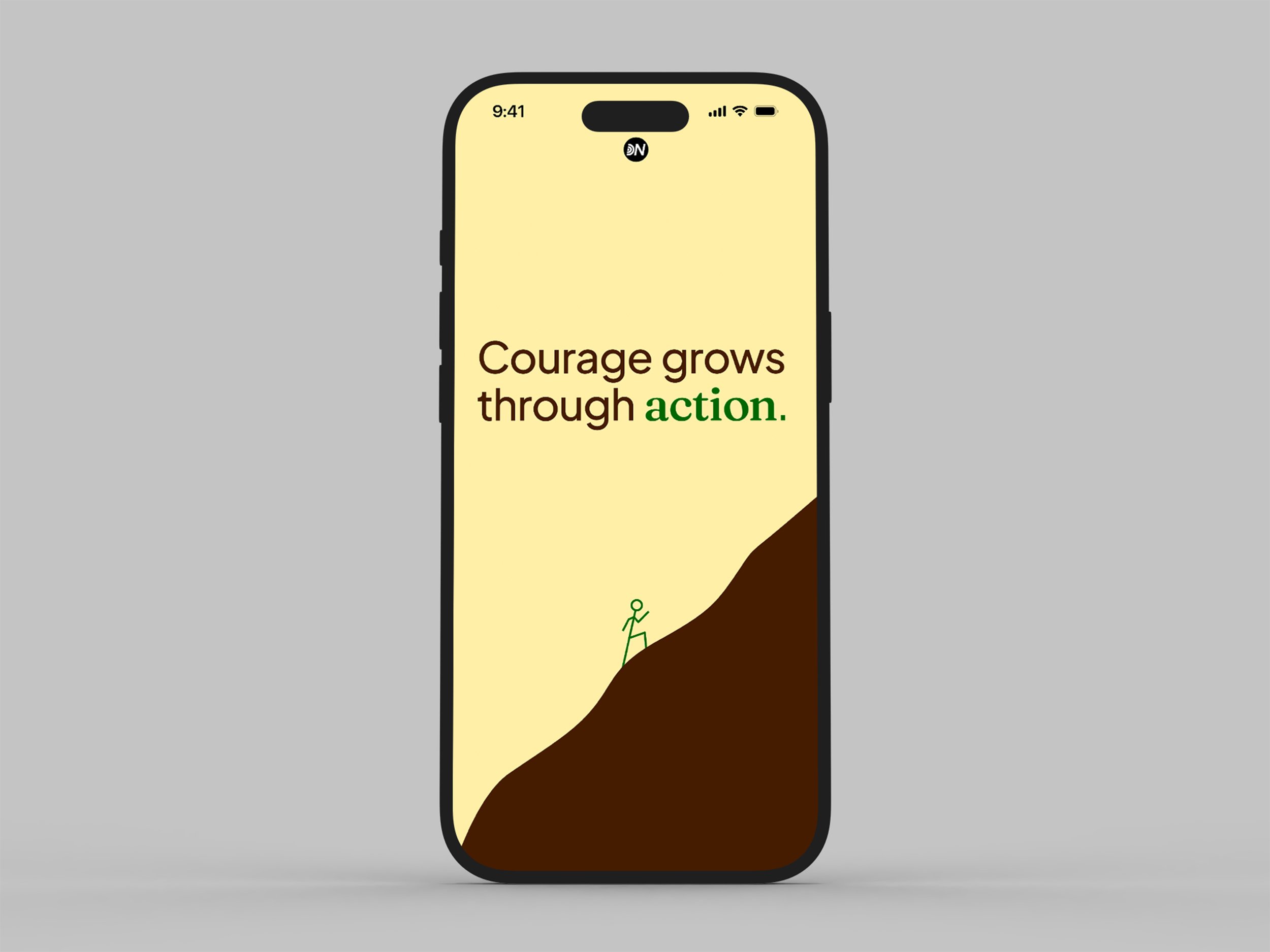
The visual system was designed to feel modern and minimal, removing unnecessary distractions and allowing the brand's message to take center stage. This approach informed the design of the logo: a simple lettermark featuring the letter D constructed from three rings. These rings symbolize both the holistic nature of the brand and personal growth, drawing inspiration from the natural progression of tree rings over time.
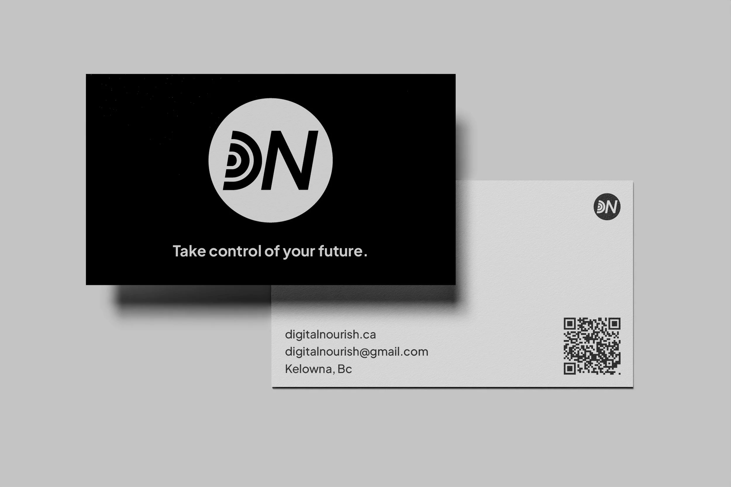
The letterforms are positioned with a forward-leaning stance, representing progress, optimism, and a focus on the future. A circular enclosure softens the overall mark, creating a more approachable and welcoming presence.
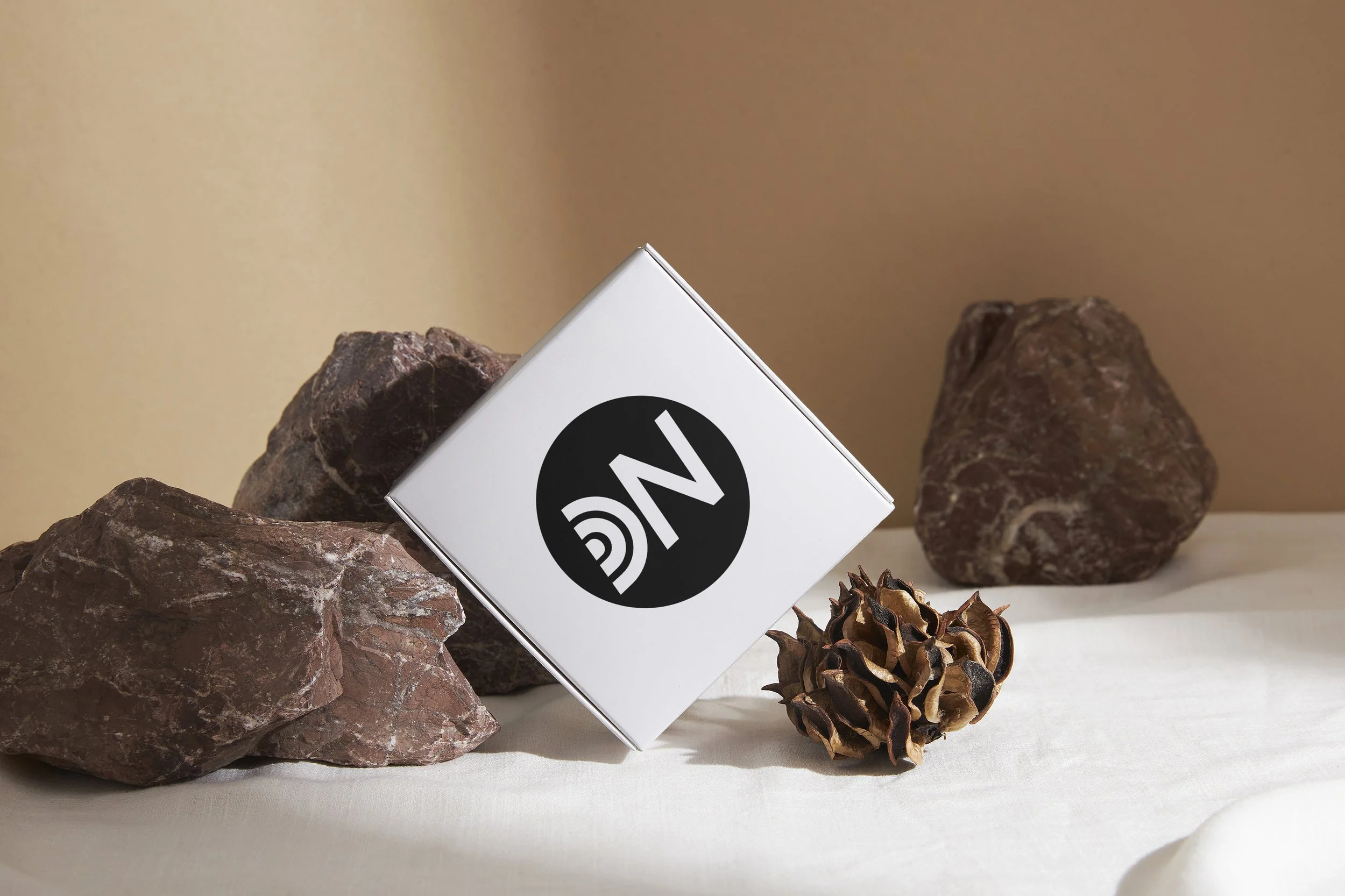
The colour palette draws from earthy tones to evoke a sense of grounding, balance, and calm. To complete the identity, Plus Jakarta Sans and Fraunces were selected for their complementary qualities, combining modern simplicity with a sense of professionalism and trust.